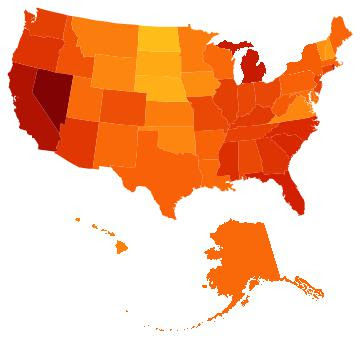
If a picture is worth a thousand words, this is a long post. The plots of the United States measure the biannual changes in the unemployment rate by state beginning in January 2008. Low rates of unemployment are yellow and high rates, dark red.
January 2008.
July 2008
January 2009
July 2009
January 2010
July 2010
January 2011
July 2011
January 2012
Some Links
2 years ago


No comments:
Post a Comment